Data Visualization is a big part of data analysis and data science. In a nutshell data visualization is a way to show complex data in a form that is graphical and easy to understand. This can be especially useful when trying to explore the data and get acquainted with it. Visuals such as plots and graphs can be very effective in clearly explaining data to various audiences. Here is a beginners guide to data visualisation using Matplotlib from a Pandas dataframe.
Fundamental design principals
All great visuals follow three key principles: less is more, attract attention, and have impact. In other words, any feature or design you include in your plot to make it more attractive or pleasing should support the message that the plot is meant to get across and not distract from it.
Matplotlib and its architecture
Let's learn first about Matplotlib and its architecture. Matplotlib is one of the most widely used, if not the most popular data visualization libraries in Python. Matplotlib tries to make basic things easy and hard things possible. You can generate plots, histograms, box plots, bar charts, line plots, scatterplots, etc., with just a few lines of code. Keep reading to see code examples.
Matplotlib's architecture is composed of three main layers: the back-end layer, the artist layer where much of the heavy lifting happens, and the scripting layer. The scripting layer is considered a lighter interface to simplify common tasks and for quick and easy generation of graphics and plots.
Import Matplotlib and Numpy.
First import Matplotlib and Matplotlib's pyplot. Note that you need to have Numpy installed for Matplotlib to work. If you work in Jupiter Notebooks you will need to write %matplotlib inline for your matplotlib graphs to be included in your notebook, next to the code.
import pandas as pd
import numpy as np
%matplotlib inline
import numpy as np
import matplotlib as mpl
import matplotlib.pyplot as plt
mpl.style.use('ggplot')
The Pandas Plot Function
Pandas has a built in .plot() function as part of the DataFrame class. In order to use it comfortably you will need to know several key parameters:
kind — Type of plot that you require. ‘bar’,’barh’,’pie’,’scatter’,’kde’ etc .
color — Sets color. It accepts an array of hex codes corresponding to each data series / column.
linestyle — Allows to select line style. ‘solid’, ‘dotted’, ‘dashed’ (applies to line graphs only)
x — label or position, default: None.
y — label, position or list of label, positions, default None. Allows plotting of one column against another.
legend— a boolean value to display or hide the legend
title — The string title of the plot
These are fairly straightforward to use and we’ll do some examples using .plot() later in the post.
Line plots in Pandas with Matplotlib
A line plot is a type of plot which displays information as a series of data points called 'markers' connected by straight line segments. It is a basic type of chart common in many fields. Use line plots when you have continuous data sets. These are best suited for trend-based visualizations of data over a period of time.
# Sample data for examples
# Manually creating a dataframe
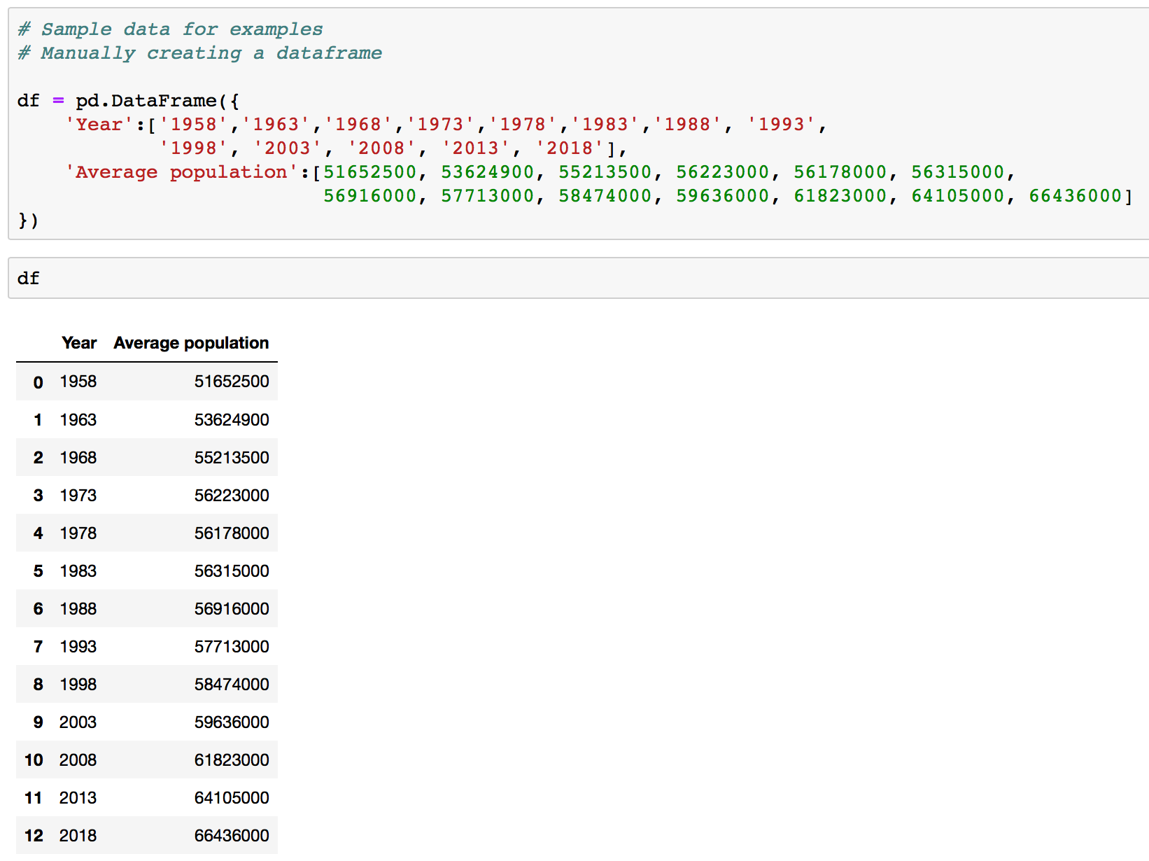
# Source: https://en.wikipedia.org/wiki/Demography_of_the_United_Kingdom

df = pd.DataFrame({
    'Year':['1958','1963','1968','1973','1978','1983','1988', '1993',
            '1998', '2003', '2008', '2013', '2018'],
    'Average population':[51652500, 53624900, 55213500, 56223000,
                          56178000, 56315000, 56916000, 57713000,
                          58474000, 59636000, 61823000, 64105000,
                          66436000]
})
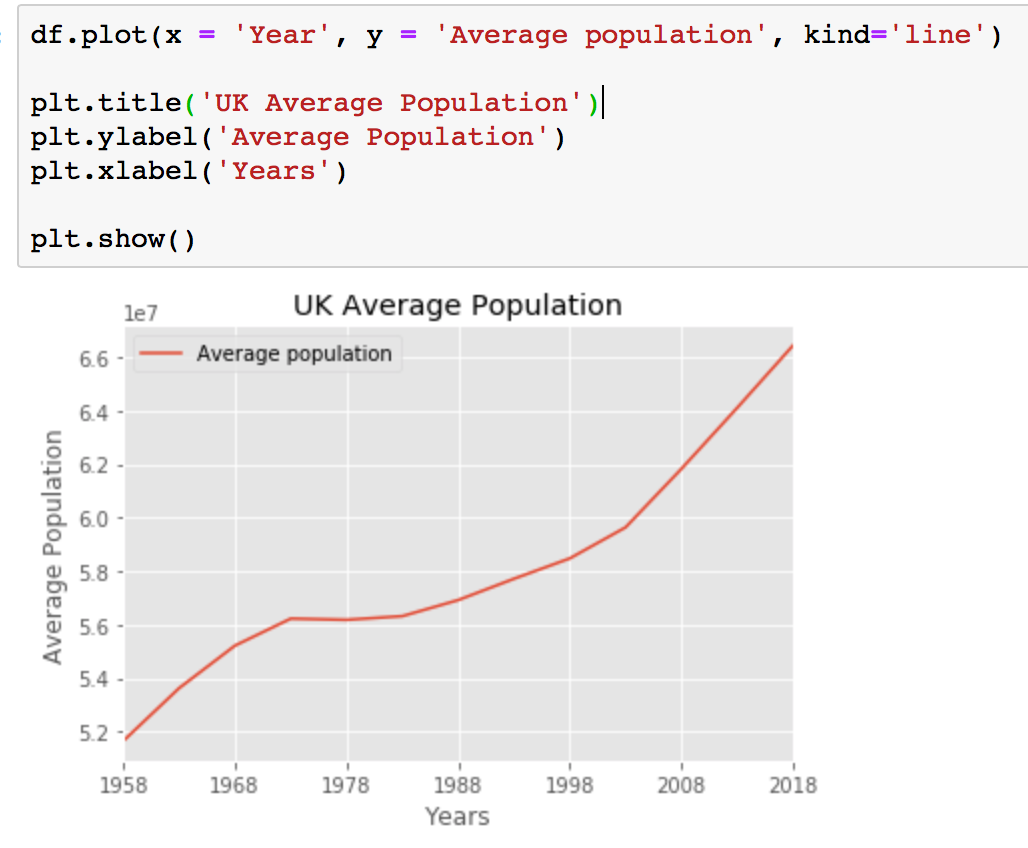
The df.plot() or df.plot(kind = 'line') commands create a line graph, and the parameters passed in tell the function what data to use. While you don't need to pass in parameter kind = 'line' in the command to get a line plot it is better to add it for the sake of clarity.
The first parameter, year, will be plotted on the x-axis, and the second parameter, average population, will be plotted on the y-axis.
df.plot(x = 'Year', y = 'Average population', kind='line')
If you want to have a title and labels for your graph you will need to specify them separately.
plt.title('text')
plt.ylabel('text')
plt.xlabel('text')
Calling plt.show() is required for your graph to be printed on screen. If you use Jupiter Notebooks and you already run line %matplotlib inline your graph will show even without you running plt.show() but, it will print an unwanted text message as well. This is why it is better to run plt.show() regardless of the environment. When run, the output will be as follows:
Bar charts in Pandas with Matplotlib
A bar plot is a way of representing data where the length of the bars represents the magnitude/size of the feature/variable. Bar graphs usually represent numerical and categorical variables grouped in intervals.
Bar plots are most effective when you are trying to visualize categorical data that has few categories. If we have too many categories then the bars will be very cluttered in the figure and hard to understand. They’re nice for categorical data because you can easily see the difference between the categories based on the size of the bar.
Now lets create a dataframe for our bar chart.
# Sample dataframe
# Source:
# https://en.wikipedia.org/wiki/List_of_countries_by_GDP_(PPP)_per_capita
# From table International Monetary Fund (2018)
# All figures are in current Geary–Khamis dollars (also known as international dollars)

Data = {'Country': ['United States','Singapore','Germany','United Kingdom','Japan'],
        'GDP_Per_Capita': [62606,100345,52559,45705,44227]
       }

df = pd.DataFrame(Data,columns=['Country','GDP_Per_Capita'])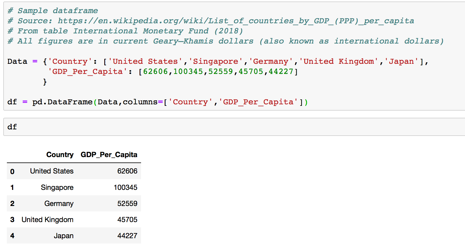
To create a bar plot we will use df.plot() again. This time we can pass one of two arguments via kind parameter in plot():
kind=barcreates a vertical bar plotkind=barhcreates a horizontal bar plot
Simmilarly df.plot() command for bar chart will require three parameters: x values, y values and type of plot.
df.plot(x ='Country', y='GDP_Per_Capita', kind = 'bar')

plt.title('GDP Per Capita in international dollars')
plt.ylabel('GDP Per Capita')
plt.xlabel('Country')

plt.show()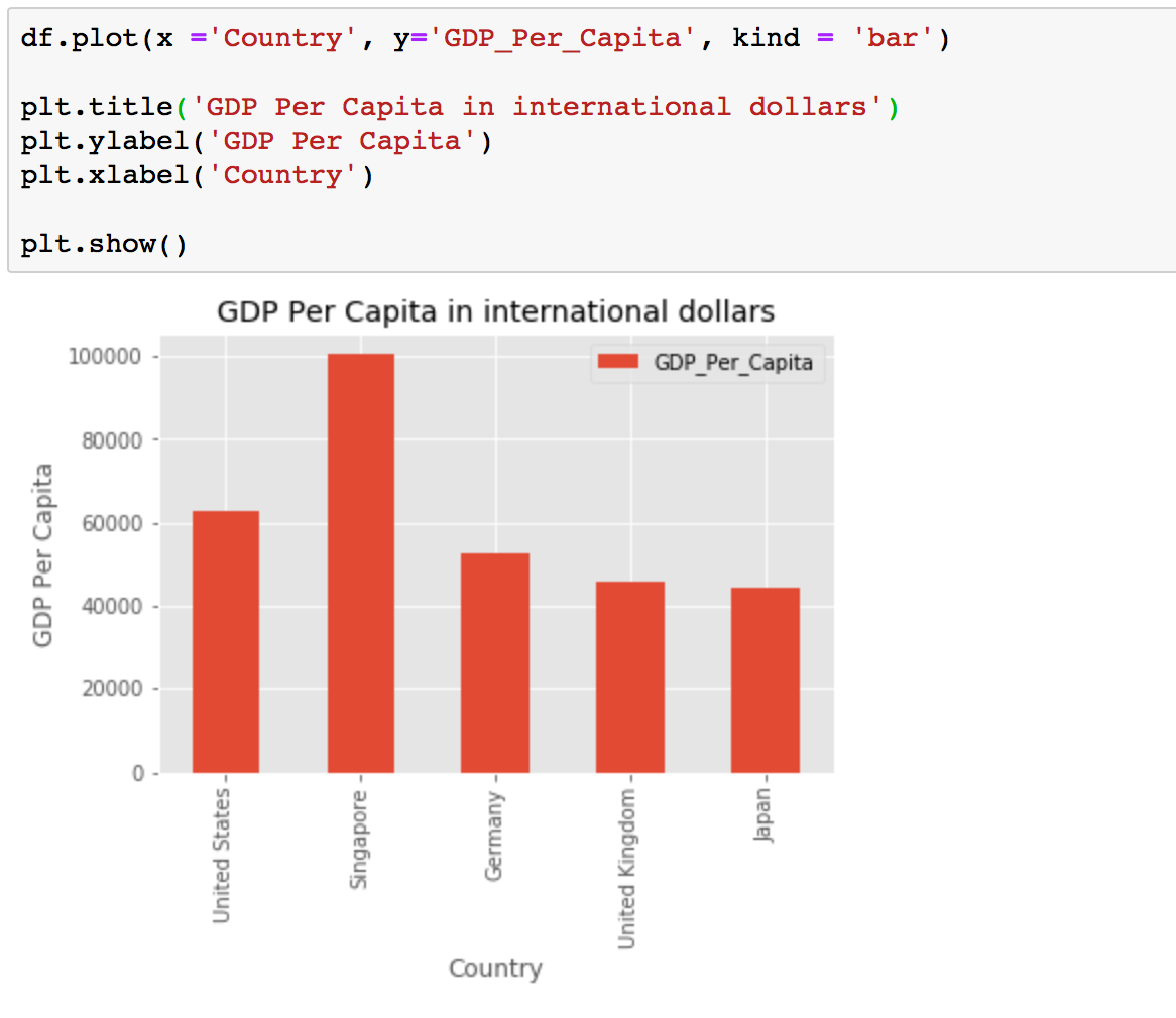
Sometimes it is more practical to represent the data horizontally, especially if you need more room for labelling the bars. In horizontal bar graphs, the y-axis is used for labelling, and the length of bars on the x-axis corresponds to the magnitude of the variable being measured. As you will see, there is more room on the y-axis to label categetorical variables.
To get a horizontal bar chart you will need to change a kind parameter in plot() to barh. You will also need to enter correct x and y labels as they are now switched compare to the standart bar chart.
df.plot(x ='Country', y='GDP_Per_Capita', kind = 'barh')

plt.title('GDP Per Capita in international dollars')
plt.ylabel(' Country')
plt.xlabel('GDP Per Capita')

plt.show()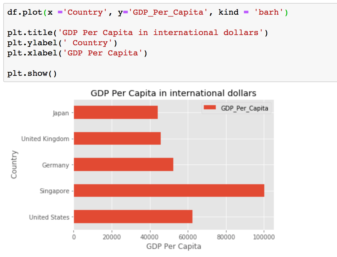
The df.plot() command allows for significant customisation. If you want to change the color of your graph you can pass in the color parameter in your plot() command. You can also remove the legend by passing legend = False and adding a title using title = 'Your Title'.
df.plot(x = 'Country',
        y = 'GDP_Per_Capita',
        kind = 'barh',
        color = 'blue',
        title = 'GDP Per Capita in international dollars',
        legend = False)
plt.show()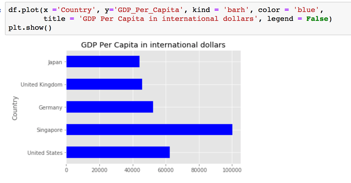
Scatter plots in Pandas with Matplotlib
Scatterplots are a great way to visualize a relationship between two variables without the potential for getting a misleading trend line from a line graph. Just like with the above graphs, creating a scatterplot in Pandas with Matplotlib only requires a few lines of code, as shown below.
Let's start by creating a dataframe for the scatter plot.
# Sample dataframe
# Source:
# https://ourworldindata.org/grapher/life-expectancy-vs-gdp-per-capita
# Data for the 2015

Data = {'Country': ['United States','Singapore','Germany',
                    'United Kingdom','Japan'],
        'GDP_Per_Capita': [52591,67110,46426,38749,36030],
        'Life_Expectancy': [79.24, 82.84, 80.84, 81.40, 83.62]
       }

df = pd.DataFrame(Data,columns=['Country','GDP_Per_Capita','Life_Expectancy'])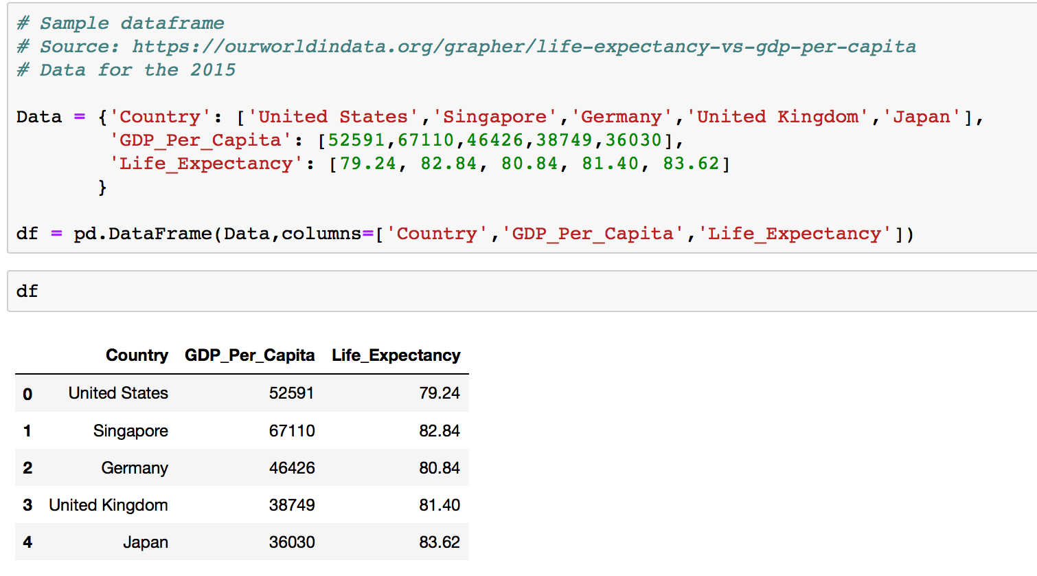
Now that you understand how the df.plot() command works, creating scatterplots is really easy. All you need to do is change the kind parameter to scatter.
df.plot(kind='scatter',x='GDP_Per_Capita',y='Life_Expectancy',color='red')

plt.title('GDP Per Capita and Life Expectancy')
plt.ylabel('Life Expectancy')
plt.xlabel('GDP Per Capita')

plt.show()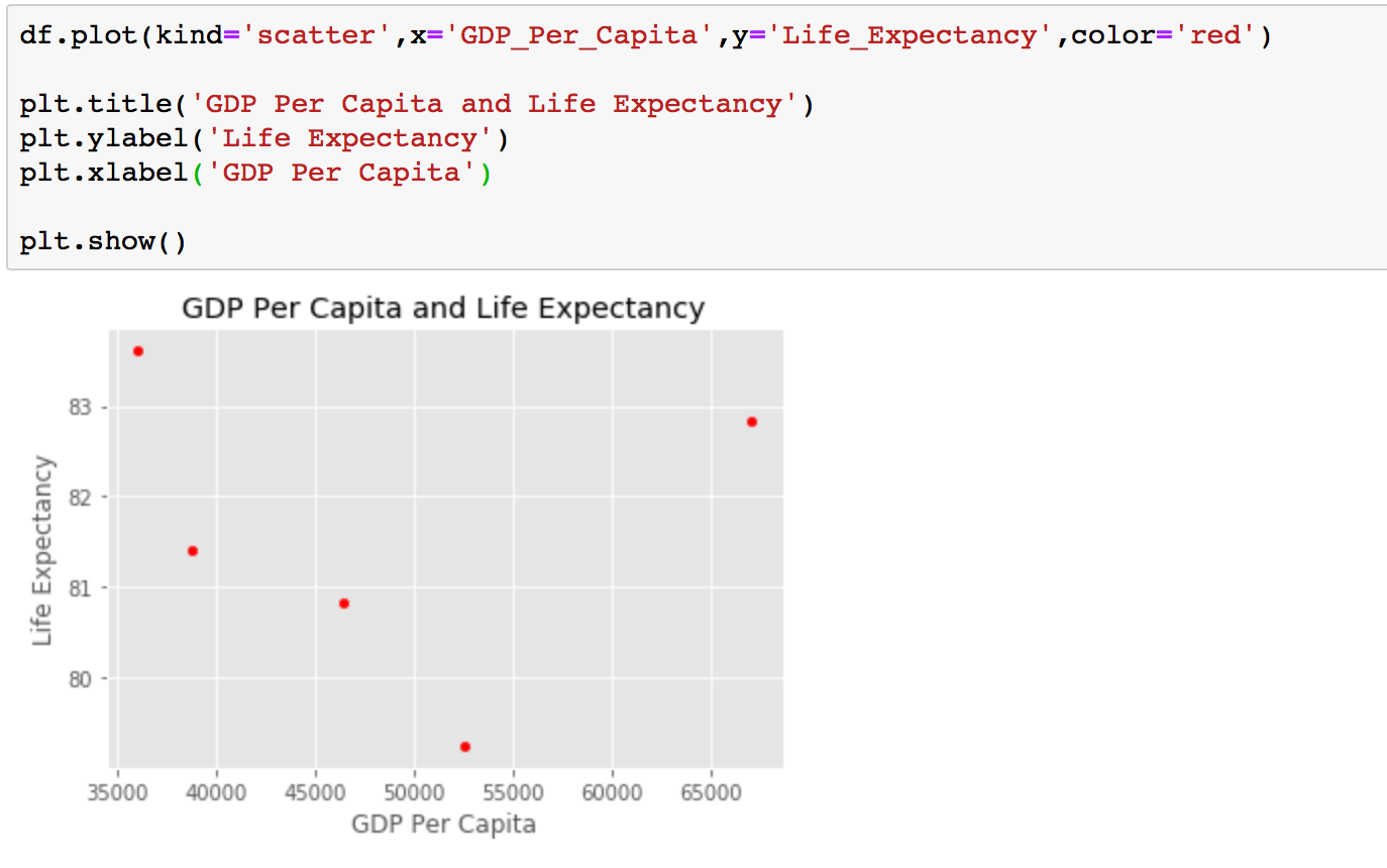
Pie charts in Pandas with Matplotlib
A pie chart is a circular graphic that displays numeric proportions by dividing a circle into proportional slices. You are most likely already familiar with pie charts as they are widely used.
Let's use a pie chart to explore the proportion (percentage) of the population split by continents.
# sample dataframe for pie chart
# source:
# https://en.wikipedia.org/wiki/List_of_continents_by_population

df = pd.DataFrame({'population': [422535000, 38304000 , 579024000,
                                  738849000, 4581757408, 1106,
                                  1216130000]},
                    index=['South America', 'Oceania', 'North America',
                           'Europe', 'Asia', 'Antarctica', 'Africa'])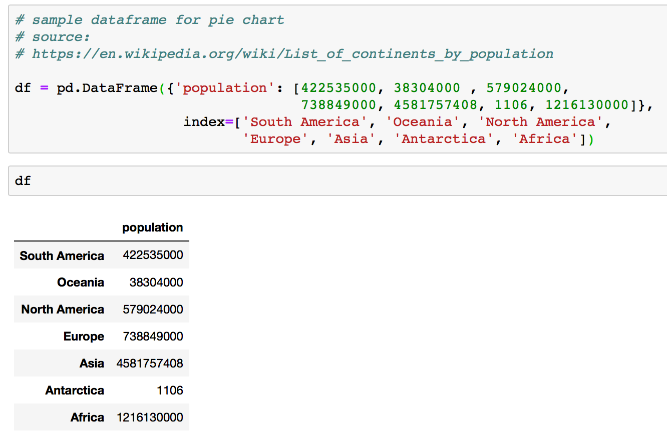
We can create pie charts in Matplotlib by passing in the kind=pie keyword in df.plot() .
df.plot(kind = 'pie', y='population', figsize=(10, 10))

plt.title('Population by Continent')

plt.show()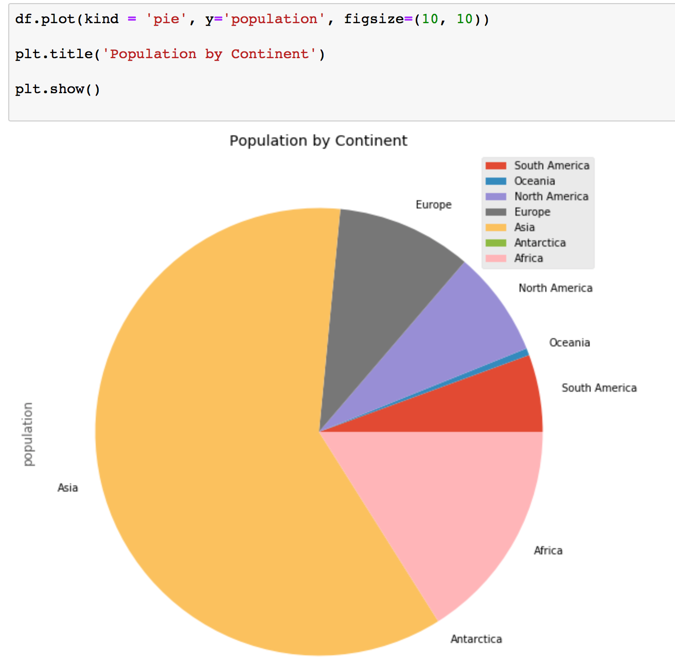
Box plots in Pandas with Matplotlib
A box plot is a way of statistically representing the distribution of the data through five main dimensions:
- Minimun: The smallest number in the dataset.
- First quartile: The middle number between the minimum and the median.
- Second quartile (Median): The middle number of the (sorted) dataset.
- Third quartile: The middle number between median and maximum.
- Maximum: The highest number in the dataset.
For the box plot, we can use the same dataframe that we used earlier for the bar chart.
# Sample dataframe
# Source:
# https://en.wikipedia.org/wiki/List_of_countries_by_GDP_(PPP)_per_capita
# From table International Monetary Fund (2018)
# All figures are in current Geary–Khamis dollars (also known as international dollars)

Data = {'Country': ['United States','Singapore','Germany',
                    'United Kingdom','Japan'],
        'GDP_Per_Capita': [62606,100345,52559,45705,44227]
       }

df = pd.DataFrame(Data,columns=['Country','GDP_Per_Capita'])To make a box plot, we can use the kind=box parameter in the plot() method invoked in a pandas series or dataframe.
df.plot(kind='box', figsize=(8, 6))

plt.title('Box plot of GDP Per Capita')
plt.ylabel('GDP Per Capita in dollars')

plt.show()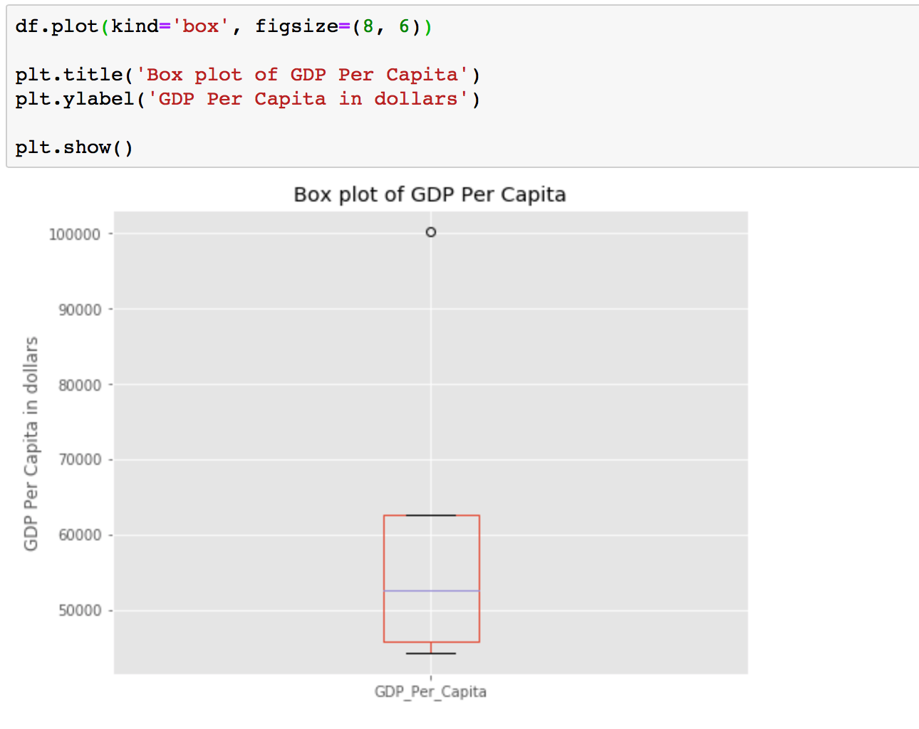
Conclusion
We just learned 5 quick and easy data visualisations using Pandas with Matplotlib. I hope you enjoyed this post and learned something new and useful. If you want to learn more about data visualisations using Pandas with Matplotlib check out Pandas.DataFrame.plot documentation.
