
In this article, you’ll learn:
- What is Correlation
- What Pearson, Spearman, and Kendall correlation coefficients are
- How to use Pandas correlation functions
- How to visualize data, regression lines, and correlation matrices with Matplotlib and Seaborn
Correlation
Correlation is a statistical technique that can show whether and how strongly pairs of variables are related/interdependent. When we look at two variables over time if one variable changes how does this affect change in another variable.
Correlation measures to what extend different variables are interdependent.
For example, lung cancer and smoking are related; smokers tend to develop lung cancer more than non-smokers. The relationship isn't perfect. You can easily think of two people you know who smoke but don't have lung cancer. Nonetheless, the average cancer development in smokers is higher than in non-smokers. Correlation can tell you just how much of the variation in chances of getting cancer is related to their cigarette consumption.
Although this correlation is fairly obvious, your data may contain unsuspected correlations. You may also suspect there are correlations but don't know which are the strongest. Intelligent correlation analysis can lead to a greater understanding of your data.
The long and short of correlation is the following: Correlation is a number between –1.0 and +1.0. A correlation could be positive, meaning both variables move in the same direction, or negative, meaning that when one variable’s value increases, the other variables values decrease. Correlation can also be neural or zero, meaning that the variables are unrelated.
- Positive Correlation: both variables change in the same direction.
- Neutral Correlation: No relationship in the change of the variables.
- Negative Correlation: variables change in opposite directions.
It is important to note that correlation doesn't imply causation. Correlation quantifies the strength of the relationship between the features of a dataset. In some cases, the association is caused by a factor common to several features of interest. (For example, umbrellas are used during the rain, but they don't cause rain).
There are several statistics that you can use to quantify correlation. In this article, you’ll learn about three correlation coefficients:
- Pearson’s r
- Spearman’s ρ (rho)
- Kendall’s τ (tau)
Pearson’s coefficient measures linear correlation, while the Spearman and Kendall coefficients compare the ranks of data.
Correlation can be useful in data analysis and modelling to better understand the relationships between variables. So it is important that you have a good understanding of it before you attempt a data analysis or modelling.
Pearson, Spearman, and Kendall correlation coefficients
- Pearson correlation - Linear correlation
One way to measoure the strenth of corelation between continuose numerical variables is to use Pearson correlation. Pearson correlation method will give you two values:
- correlation coefficient
- p-value
The Pearson correlation coefficient (named for Karl Pearson) can be used to summarize the strength of the linear relationship between two data samples.
Several conditions have to be met for Pearson correlation:
- The variables x and y must have a linear relationship.
- Both variables x and y must be numerical (or quantitative). That is, they must represent measurements with no restriction on their level of precision. For example, numbers with many places after the decimal point (such as 11.332 or 0.229) must be possible.
- The y values must have a normal distribution for each x, with the same variance at each x.
The Pearson’s correlation coefficient is calculated as the covariance of the two variables divided by the product of the standard deviation of each data sample. It is the normalization of the covariance between the two variables to give an interpretable score.
Correlation coefficient and p-value will tell you the following:
Correlation coefficient
- close to +1: Large Positive relationship
- close to -1: Large Negative relationship
- close to 0: No relationship
P-value
- P-value <0.001: Strong certainty in the result
- P-value <0.05: Moderate certainty in the result
- P-value <0.1: Weak certainty in the result
- P-value > 0.1: No certainty in the result
The Pearson’s correlation coefficient can be used to evaluate the relationship between more than two variables.
This can be done by calculating a matrix of the relationships between each pair of variables in the dataset. The result is a symmetric matrix called a correlation matrix with a value of 1.0 along the diagonal as each column always perfectly correlates with itself.
- Spearman Correlation - Rank correlation
Pearson’s correlation coefficient is the most common correlation measure out there, but it is not the only one out there. Pearson’s correlation can't be used in all cases. It can be used only when certain conditions are met (those are listed above). If those conditions are not met, the rank correlation can be used (Spearman and Kendall correlation).
Pearson correlation assumes that the data we are comparing is normally distributed. When that assumption is not true, the correlation value is reflecting the true association. Spearman correlation does not assume that data is from a specific distribution, so it is a non-parametric correlation measure.
Spearman’s rank correlation doesn’t require the relationship between the variables x and y to be linear, nor does it require the variables to be numerical. You use Spearman’s rank when the variables are ordinal or/and quantitative. Rather than examining a linear relationship between x and y, Spearman’s rank correlation tests whether two ordinal or/and quantitative variables are dependent.
Note that Spearman’s rank applies to ordinal data only.
Spearman's correlation coefficient, (ρ, also signified by rs) measures the strength and direction of the association between two ranked variables. You interpret the value of Spearman’s rank correlation, ρ the same way you interpret Pearson’s correlation, r. The values of ρ can go between –1 and +1. The higher the magnitude of ρ (in the positive or negative directions), the stronger the relationship.
- Kendall correlation - Rank correlation
The Kendall correlation coefficient compares the number of concordant and discordant pairs of data. This coefficient is based on the difference in the counts of concordant and discordant pairs relative to the number of x-y pairs. It’s often denoted with τ called Kendall’s tau. It is considered an alternative to the nonparametric Spearman correlation coefficient (especially when you have a small sample size with many tied ranks).
Important facts about the Kendall correlation coefficient are:
- It can take a real value in the range −1 ≤ τ ≤ 1.
- Its maximum value τ = 1 corresponds to the case when the ranks of the corresponding values in x and y are the same. In other words, all pairs are concordant.
- Its minimum value τ = −1 corresponds to the case when the rankings in x are the reverse of the rankings in y. In other words, all pairs are discordant.
Correlation Calculation in Pandas
Pandas offers .corr() function that we can use to calculate correlation coefficient.
Pandas dataframe.corr() is used to find the pairwise correlation of all columns in the dataframe. Any NA values are automatically excluded. For any non-numeric data type columns in the dataframe it is ignored.
df.corr(self, method='pearson', min_periods=1)
Parameters:
methods :
- pearson : Standard correlation coefficient
- kendall : Kendall Tau correlation coefficient
- spearman : Spearman rank correlation
min_periods : Minimum number of observations required per pair of columns to have a valid result. Currently only available for Pearson and Spearman correlation.
It returns a dataframe (Correlation matrix).
Let's create a datasets to illustare how the function works.
Here we are creating a dataframe with two columns that have positive correlation.
# creating a datasets to illustrate positive correlation.
# importing libraries
import numpy as np
import pandas as pd
from numpy import mean
from numpy import std
from numpy.random import randn
from numpy.random import seed
from matplotlib import pyplot
# seed random number generator
seed(1)
# creating data for columns
d1 = 30 * randn(1500) + 100
d2 = d1 + (20 * randn(1500) + 50)
# let's convert to a dataframe
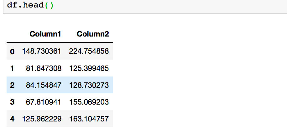
df = pd.DataFrame({'Column1': d1, 'Column2': d2})
# summarize
print('d1: mean=%.3f stdv=%.3f' % (mean(d1), std(d1)))
print('d2: mean=%.3f stdv=%.3f' % (mean(d2), std(d2)))
# plot
pyplot.scatter(d1, d2)
pyplot.show()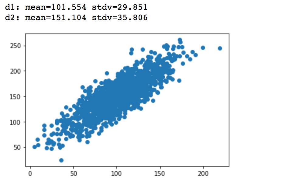
Now let's calculate Pearson Correlation Coefficient with Pandas .corr() and prove that we are dealing with the positive correlation.
You will need to run df.corr(method ='pearson') to get Pearson correlation coefficient for your dataframe.
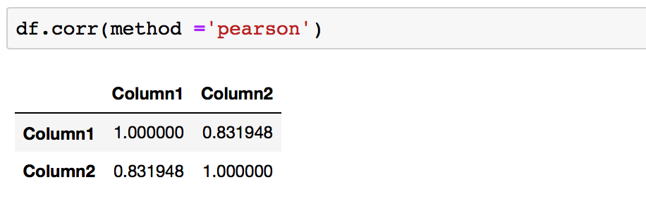
This is what we expected for the dataframe as it was created to show a positive correlation.
A correlation coefficient close to +1 demonstrates a large positive relationship. Any column correlation with self will result in 1. Here the correlation between column1 and column2 is 0.83, which is close to +1, and so this confirms that we are dealing with positive correlation.
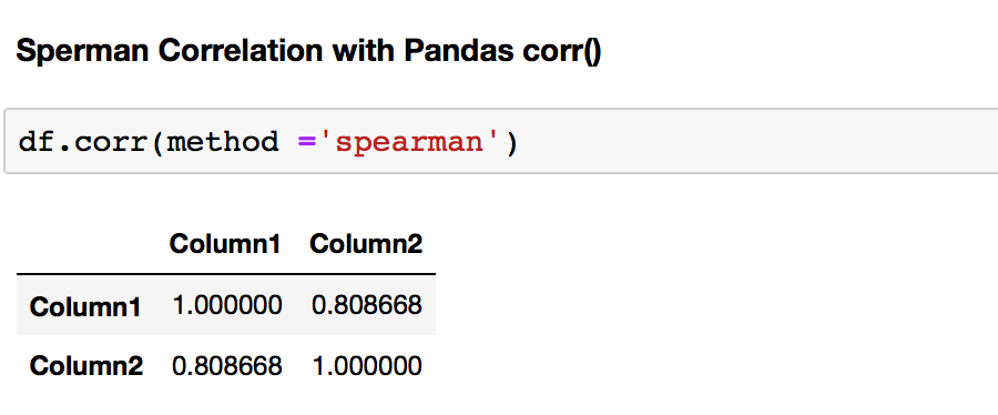
Let's calculate Spearman Correlation Coefficient with Pandas .corr() and prove that we are dealing with the positive correlation.
You will need to run df.corr(method ='spearman') to get Pearson Correlation Coefficient for your dataframe.
Finally, let's calculate Kendall Correlation Coefficient with Pandas .corr() and prove that we are dealing with the positive correlation.
You will need to run df.corr(method ='kendall') to get Pearson Correlation Coefficient for your dataframe.
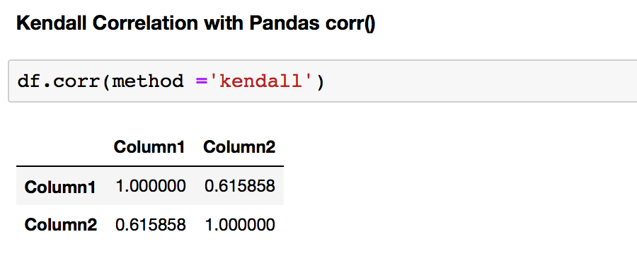
The first thing that strikes when comparing correlation coefficients for the test dataframe computed by Pearson and Spearman and Kendall correlation coefficients is the difference between them. Why are they different? We can understand the difference if we understand the assumption of each method.
As mentioned before, Pearson's correlation assumes the data is normally distributed. However, Spearman's and Kendall's correlations don't make any assumption on the distribution of the data. That is the main reason for the difference.
Correlation Calculation in SciPy
Pandas does not have a function that calculates p-values, so it is better to use SciPy to calculate correlation as it will give you both p-value and correlation coefficient.
SciPy library has many statistics routines contained in scipy.stats. You can use the following methods to calculate the three correlation coefficients you saw earlier:
pearsonr()spearmanr()kendalltau()
That's how you would use these functions in Python:
We will create a new test dataframe this time with negative correlation.
# creating a datasets to illustrate negative correlation.

# importing libraries
import numpy as np
import pandas as pd
import scipy

from numpy import mean
from numpy import std
from numpy.random import randn
from numpy.random import seed
from matplotlib import pyplot

# seed random number generator
seed(24)

# prepare data
d1 = 30 * randn(1000) + 100
d2 = d1 * -1 + (20 * randn(1000) + 50)

# let's convert to a dataframe
df = pd.DataFrame({'Column1': d1, 'Column2': d2})

# summarize
print('d1: mean=%.3f stdv=%.3f' % (mean(d1), std(d1)))
print('d2: mean=%.3f stdv=%.3f' % (mean(d2), std(d2)))

# plot
pyplot.scatter(d1, d2)
pyplot.show()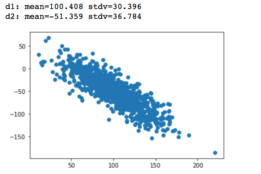
- Pearson correlation coefficient and the p-value
The scipy.stats.pearsonr(x, y) calculates a Pearson correlation coefficient and the p-value for testing non-correlation.
The Pearson correlation coefficient measures the linear relationship between two datasets.
The p-value roughly indicates the probability of an uncorrelated system producing datasets that have a Pearson correlation at least as extreme as the one computed from these datasets. The p-values are not entirely reliable but are probably reasonable for datasets larger than 500 or so.
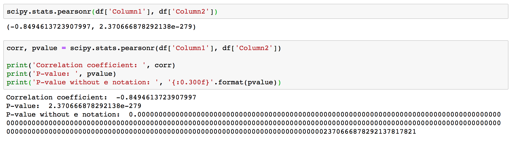
As expected, the function produced correlation coefficient -0.8494613, that is close to -1, and it confirms a strong negative correlation. The returned p-value is < 0.001, and so it confirms strong certainty in the result.
- Spearman correlation coefficient and the p-value
The scipy.stats.spearmanr(a, b=None, axis=0, nan_policy='propagate') calculates a Spearman correlation coefficient with associated p-value.
The Spearman rank-order correlation coefficient is a nonparametric measure of the monotonicity of the relationship between two datasets. Unlike the Pearson correlation, the Spearman correlation does not assume that both datasets are normally distributed.
The p-value roughly indicates the probability of an uncorrelated system producing datasets that have a Spearman correlation at least as extreme as the one computed from these datasets.
Parameters:
- a, b: 1D or 2D array_like, b is optional. One or two 1-D or 2-D arrays containing multiple variables and observations. When these are 1-D, each represents a vector of observations of a single variable. For the behavior in the 2-D case, see under
axis, below. Both arrays need to have the same length in theaxisdimension. - axis : int or None, optional. If axis=0 (default), then each column represents a variable, with observations in the rows. If axis=1, the relationship is transposed: each row represents a variable, while the columns contain observations. If axis=None, then both arrays will be raveled.
- nan_policy : {‘propagate’, ‘raise’, ‘omit’}, optional. Defines how to handle when input contains nan. The following options are available (default is
propagate):propagate: returns nan,raise: throws an error, andomit: performs the calculations ignoring nan values
The scipy.stats.spearmanr(a, b=None, axis=0, nan_policy='propagate') function returns:
- correlation : float or ndarray (2-D square). Spearman correlation matrix or correlation coefficient (if only 2 variables are given as parameters. Correlation matrix is square with length equal to total number of variables (columns or rows) in a and b combined.
- p-value : float. The two-sided p-value for a hypothesis test whose null hypothesis is that two sets of data are uncorrelated, has same dimension as rho.
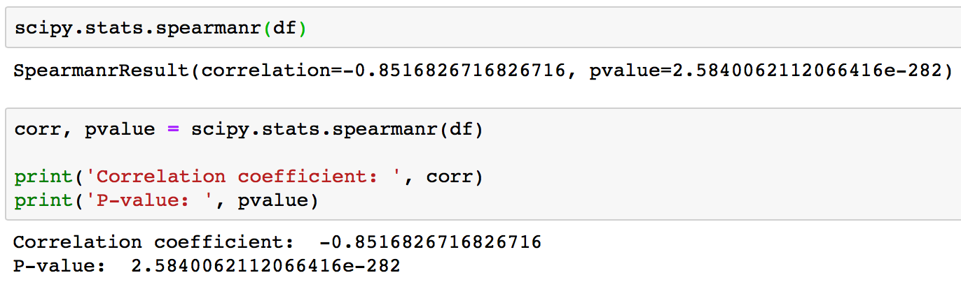
We know that the data is Gaussian and that the relationship between the variables is linear. Nevertheless, the nonparametric rank-based approach shows a strong correlation between the variables of 0.85. Returned p-value is < 0.001 and so confirms strong certainty in the result.
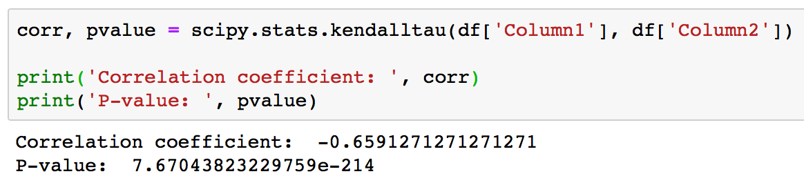
- Kendall correlation coefficient and the p-value
The scipy.stats.kendalltau(x, y, nan_policy='propagate', method='auto') calculates Kendall’s tau, a correlation measure for ordinal data.
Kendall’s tau is a measure of the correspondence between two rankings. Values close to 1 indicate strong agreement, values close to -1 indicate strong disagreement.
Parameters:
- x, yarray_like. Arrays of rankings, of the same shape. If arrays are not 1-D, they will be flattened to 1-D.
- nan_policy : {‘propagate’, ‘raise’, ‘omit’}, optional. Defines how to handle when input contains nan. The following options are available (default is
propagate):propagate: returns nan,raise: throws an error, andomit: performs the calculations ignoring nan values. - method: {‘auto’, ‘asymptotic’, ‘exact’}, optional. Defines which method is used to calculate the p-value. The following options are available (default is
auto):auto: selects the appropriate method based on a trade-off between speed and accuracy.asymptotic: uses a normal approximation valid for large samples.exact: computes the exact p-value, but can only be used if no ties are present.
The scipy.stats.kendalltau(x, y, nan_policy='propagate', method='auto') function returns:
- correlation float
- The tau statistic - p-value float. The two-sided p-value for a hypothesis test whose null hypothesis is an absence of association, tau = 0.
Visualization of Correlation with Matplotlib and Seaborn
The fastest way to learn more about your data is to use data visualization. In this section, you’ll learn how to visually represent the relationship between two features with an x-y plot. You’ll also use heatmaps to visualize a correlation matrix and scatterplot matrix.
- Scatterplot matrix
A scatterplot shows the relationship between two variables as dots in two dimensions, one axis for each attribute. You can create a scatterplot for each pair of attributes in your data. Drawing all these scatterplots together is called a scatterplot matrix.
Scatter plots are useful for spotting structured relationships between variables, like whether you could summarize the relationship between two variables with a line. Attributes with structured relationships may also be correlated and good candidates for removal from your dataset. You don't need to delete anything from the test dataframe, but when dealing with real world data this can be necessary.
pandas.plotting.scatter_matrix(frame, alpha=0.5, figsize=None, ax=None, grid=False, diagonal='hist', marker='.', density_kwds=None, hist_kwds=None, range_padding=0.05, **kwargs) - The command syntax for a scatterplot matrix.
For scatterplt matrix we are using the same test df as in SciPy section.
# Scatterplot Matrix - Histogram plots

# import pandas
# from matplotlib import pyplot

from pandas.plotting import scatter_matrix

scatter_matrix(df, figsize = (14,8))
pyplot.show()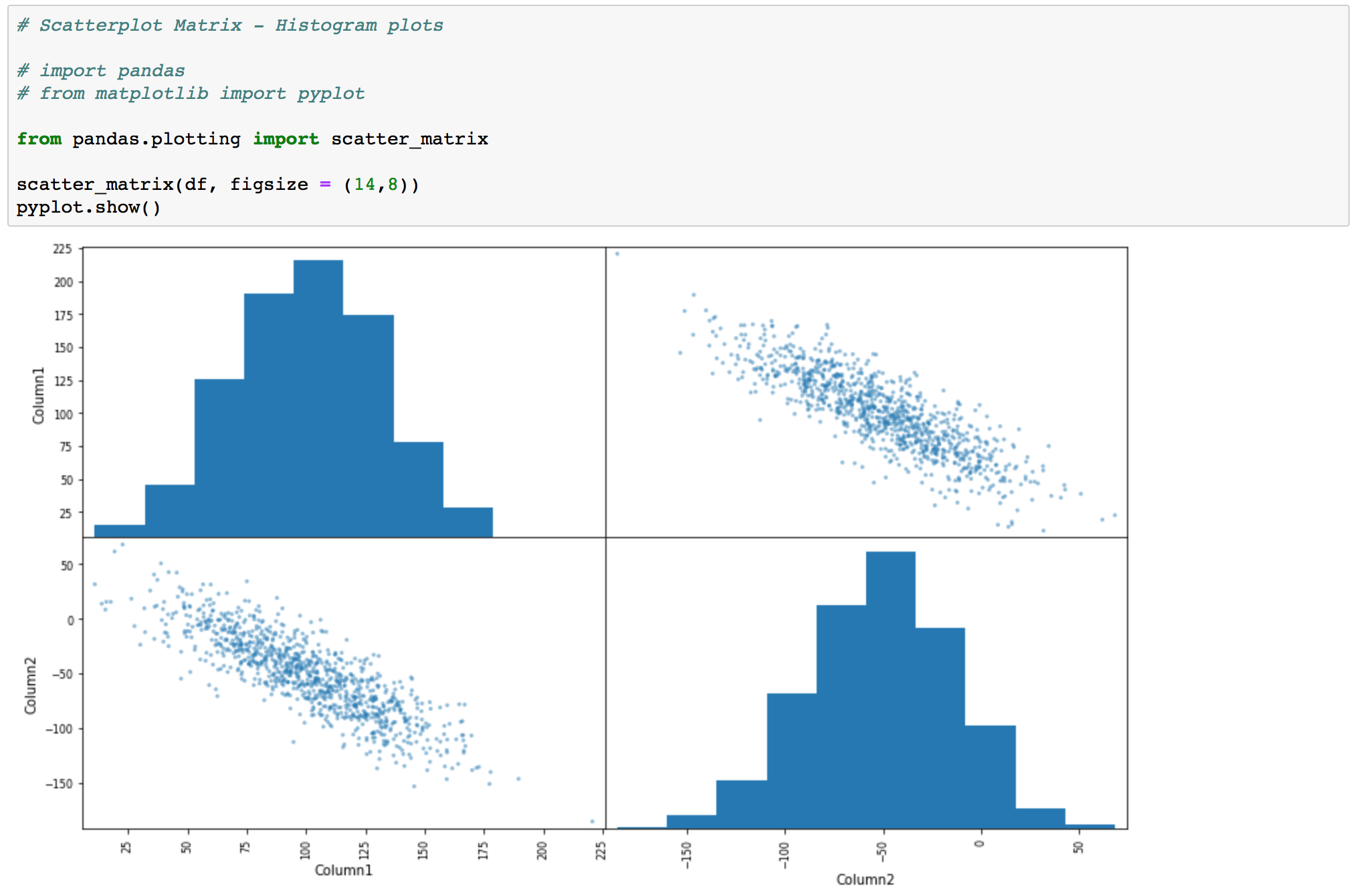
# Scatterplot Matrix - Kernel Density Estimation

scatter_matrix(df, alpha = 0.3, figsize = (14,8), diagonal = 'kde')
pyplot.show()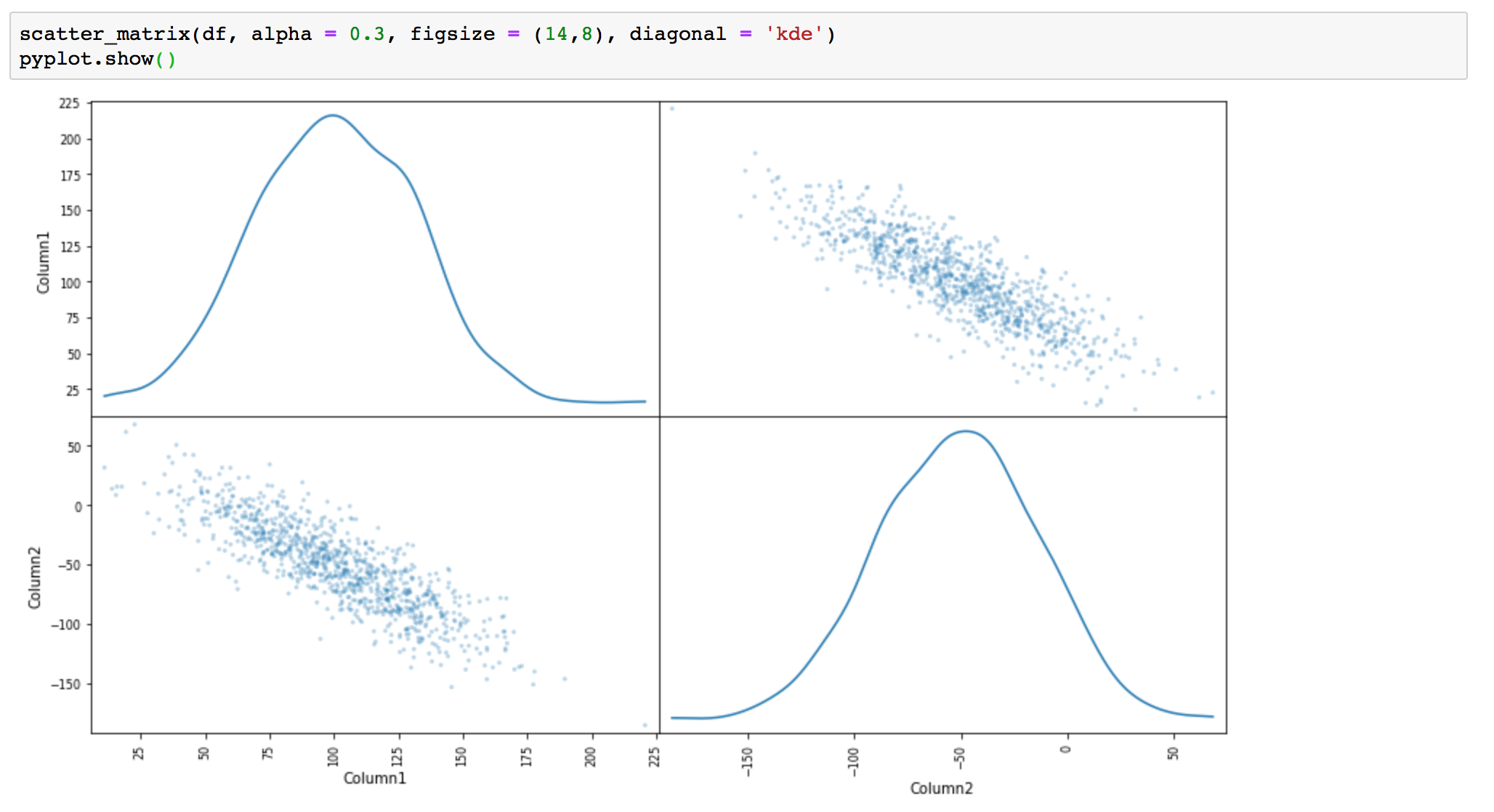
- X-Y Plots With a Regression Line
Now you’ll see how to create an x-y plot with the regression line, its equation, and the Pearson correlation coefficient. The slope and the intercept of the regression line, as well as the correlation coefficient are calculated with linregress().
# creating X-Y Plots With a Regression Line

# slope, intersept, and correlation coefficient calculation
slope, intercept, r, p, stderr = scipy.stats.linregress(df['Column1'], df['Column2'])

line = f'Regression line: y={intercept:.2f}+{slope:.2f}x, r={r:.2f}'

# plotting
fig, ax = pyplot.subplots(figsize = (14,8))
ax.plot(df['Column1'], df['Column2'], linewidth=0, marker='s', label='Data points')
ax.plot(df['Column1'], intercept + slope * df['Column1'], label=line)
ax.set_xlabel('Column1')
ax.set_ylabel('Column2')
ax.legend(facecolor='white')
pyplot.show()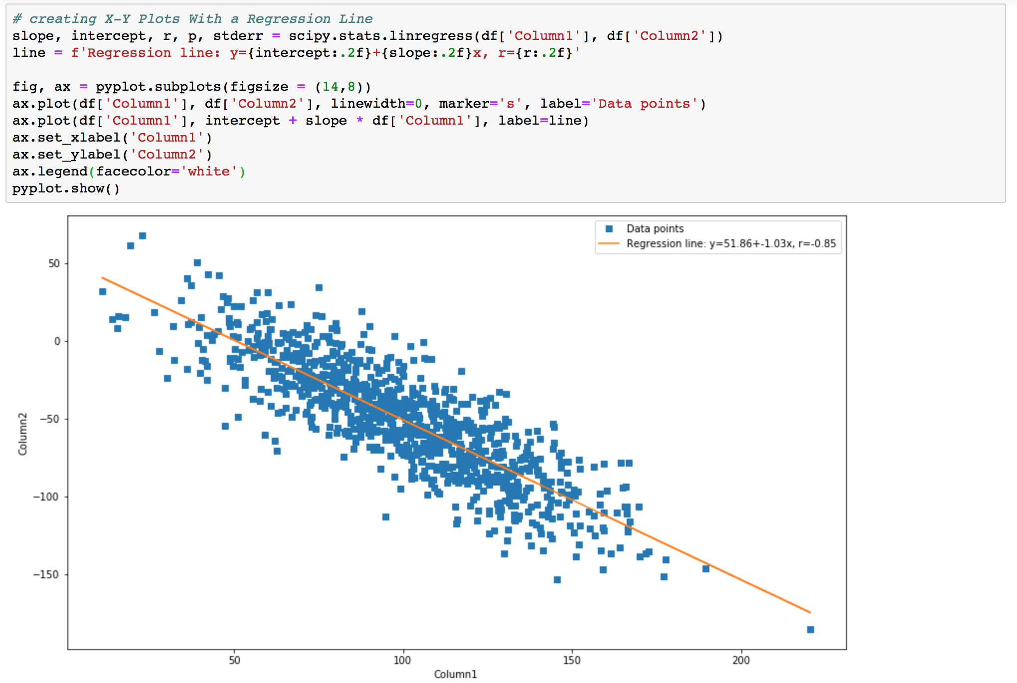
- Heatmaps of Correlation Matrices
You can calculate the correlation between each pair of attributes. This is called a correlation matrix. You can then plot the correlation matrix and get an idea of which variables have a high correlation with each other.
The easiest way to get a pretty heatmap is to use seaborn library. So let's do this.
seaborn.heatmap(data, vmin=None, vmax=None, cmap=None, center=None, robust=False, annot=None, fmt='.2g', annot_kws=None, linewidths=0, linecolor='white', cbar=True, cbar_kws=None, cbar_ax=None, square=False, xticklabels='auto', yticklabels='auto', mask=None, ax=None, **kwargs) - Plots rectangular data as a color-encoded matrix.
import seaborn as sns

f, ax = pyplot.subplots(figsize=(14, 8))
corr = df.corr()
sns.heatmap(corr, mask=np.zeros_like(corr, dtype=np.bool), cmap=sns.diverging_palette(220, 10, as_cmap=True),
            square=True, annot=True, ax=ax)
Your output should look like this:
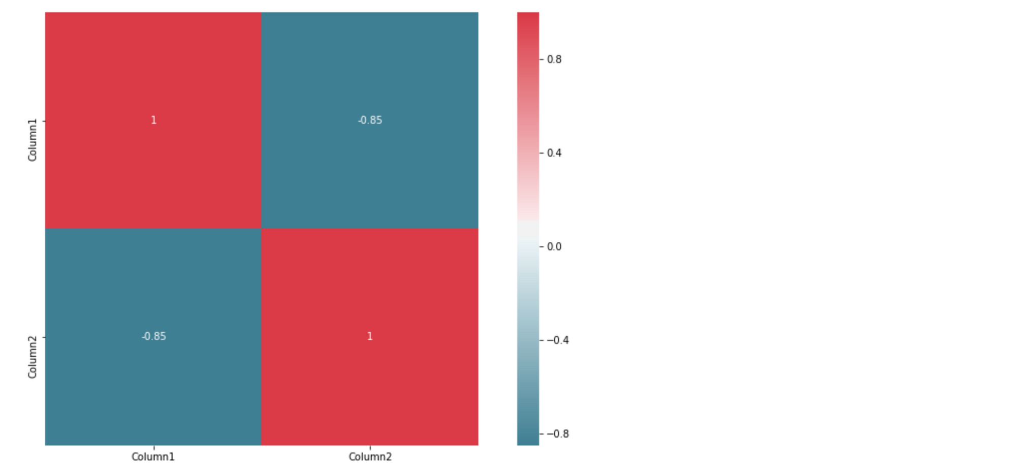
The command returns a table with the coefficients. It sort of looks like the Pandas output with colored backgrounds. The colors help you interpret the output. In this example, the red color represents the number 1, blue corresponds to -0.85.
Conclusion
You now should have an understanding of correlation, correlation coefficients and p-values.
You can calculate with Python:
- Pearson’s product-moment correlation coefficient and p value
- Spearman’s rank correlation coefficient and p value
- Kendall’s rank correlation coefficient and p value
You also know how to visualize data as: regression lines, scatterplot matrices, and correlation heatmaps with Matplotlib plots or Seaborn.